GoFundMe Unified SUSI
GoFundMe Unified SUSI
Designing a consistent Sign Up / Sign In (SUSI) experience 🤳
Timeline:
2 months
2 months
Team:
2 product managers
1 product designer
1 content designer
2 product managers
1 product designer
1 content designer
Content areas:
Clarity
Error messages
Clarity
Error messages
Tools:
Figma
Figma
Overview
GoFundMe users currently have two methods of signing in or signing up: "via the homepage or after clicking "Start a GoFundMe" (within the Create flow). Due to the recent redesign of the Create flow, there are inconcistencies between the SUSI experiences from the homepage versus the Create flow. This project aimed to unify these experiences while also creating more consistent language and helpful error messages.
Opportunity

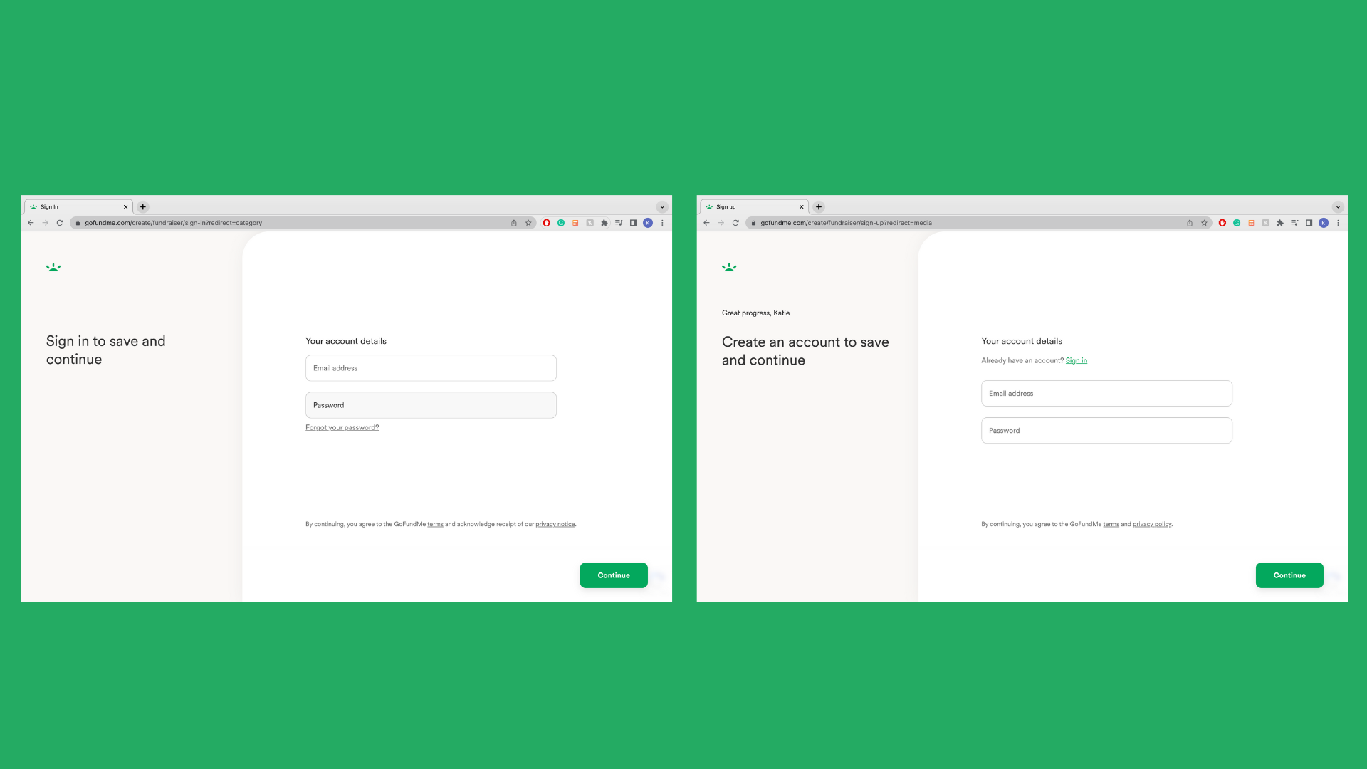
Homepage SUSI
Create flow SUSI
1. Clarity and Consistency
The SUSI experience between the homepage and Create flow were two different designs with inconsistent language and tone (see images above). This created confusion for the user as it often felt like two completely different experiences.
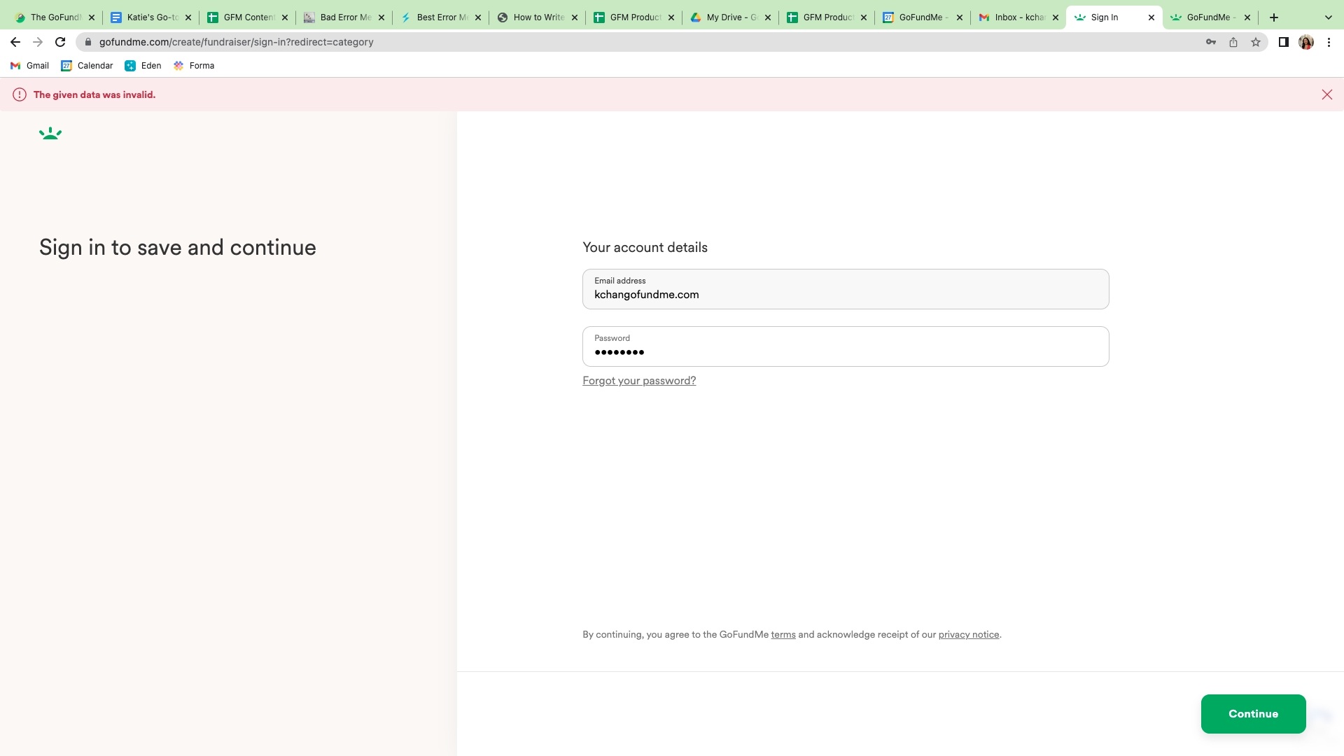
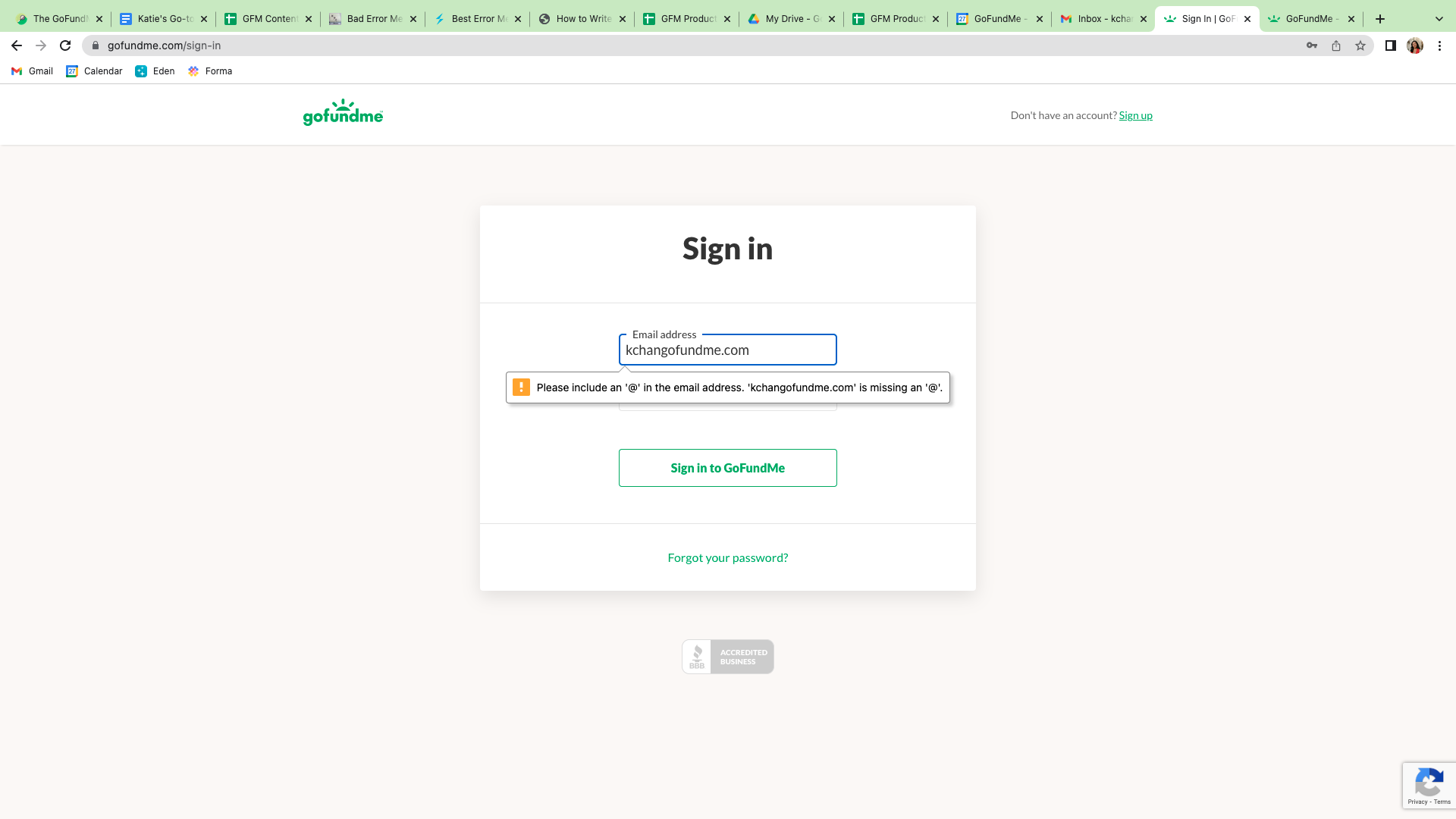
2. Unhelpful Error Messages
The error messages for both experiences were unhelpful and frustrating for the user as they did not specify to the user what went wrong nor point them in the right direction. Most of the error messages were one generic line “The given data was invalid.”
The SUSI experience between the homepage and Create flow were two different designs with inconsistent language and tone (see images above). This created confusion for the user as it often felt like two completely different experiences.
2. Unhelpful Error Messages
The error messages for both experiences were unhelpful and frustrating for the user as they did not specify to the user what went wrong nor point them in the right direction. Most of the error messages were one generic line “The given data was invalid.”
Approach
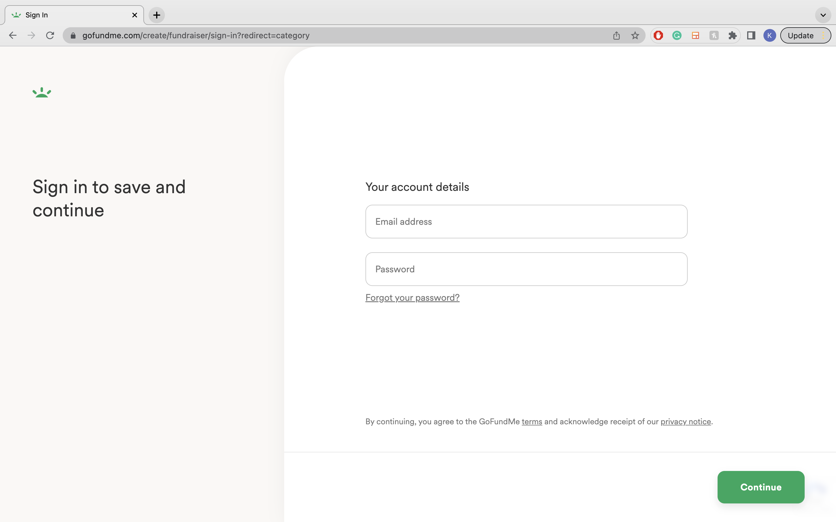
When I was added to the project, many of the designs were already finalized as they were making them consistent with the redesigned Create flow.
Beneficiary and Team member SUSI
One of the main problems I had to work through was making the SUSI process clear for first time and/or returning team members and beneficiaries.
The current copy had a lot of text that did not consider mobile:

Original copy
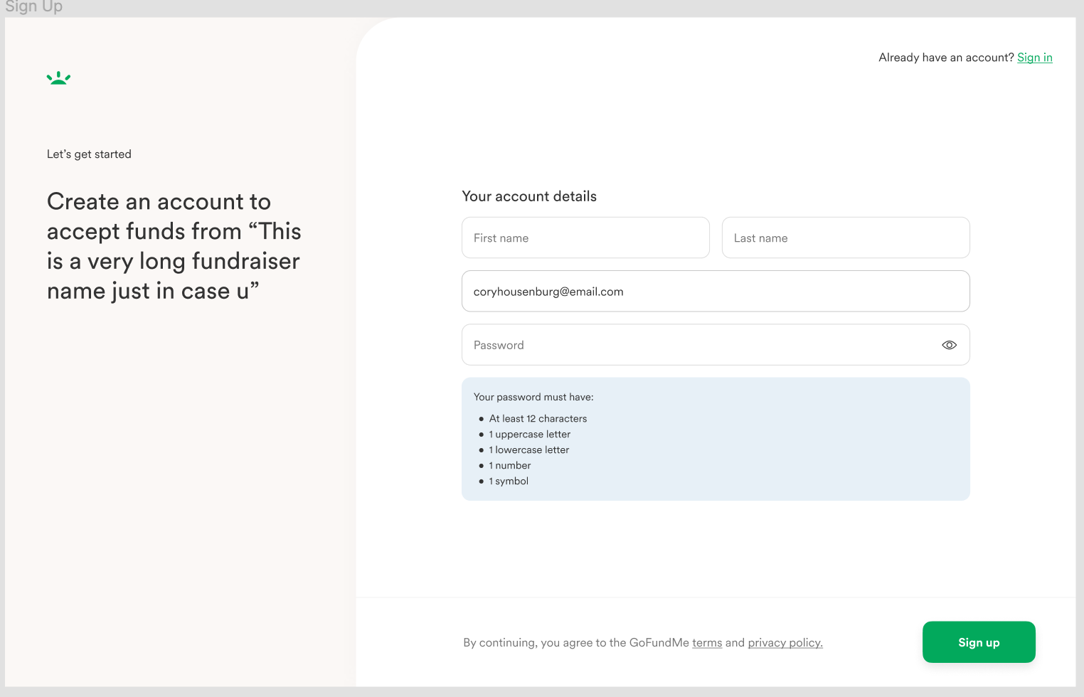
Experimenting with the character limit
I started by playing around with the subtext and eyebrow copy. What could provide better context? What is essential for the user to know? How can that all be translated with limited character count?
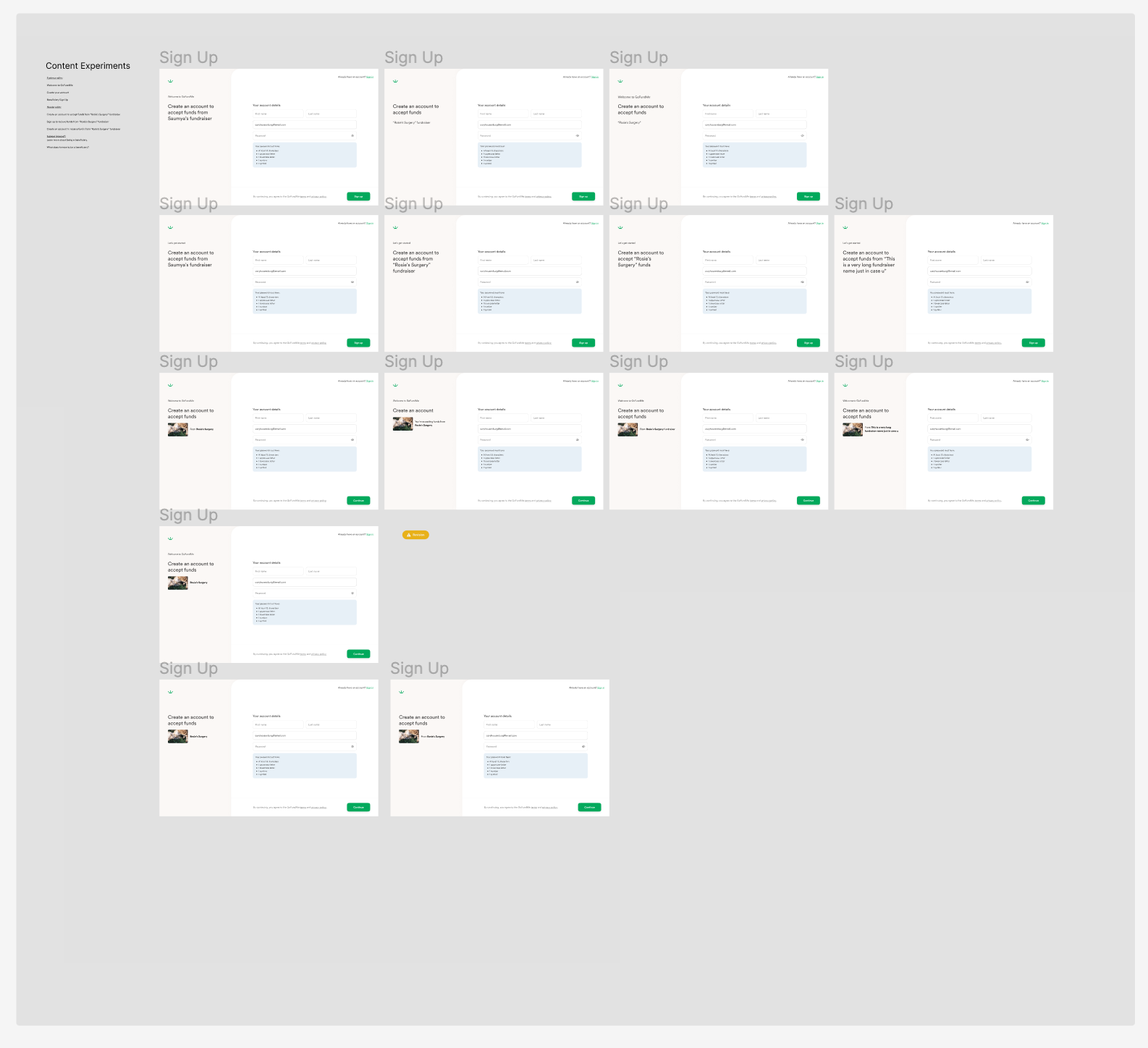
Content experiments in Figma

Revised team member sign in
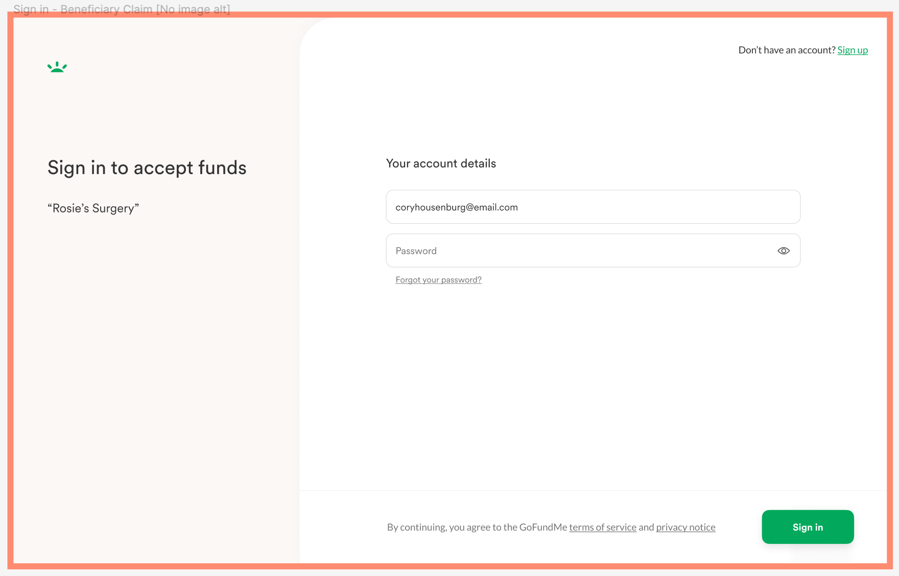
Revised beneficiary sign in
Error messages
There was a complete overhaul of the generic error message that had previously existed in the SUSI experience. This meant working through all the different scenarios where mistakes could happen in the SUSI process.
When writing the error messages, I kept them short and helpful by pointing out the error and what the user’s next step would be all while keeping a friendly tone.
Here are a couple use cases and their execution:
Forgot password flow:
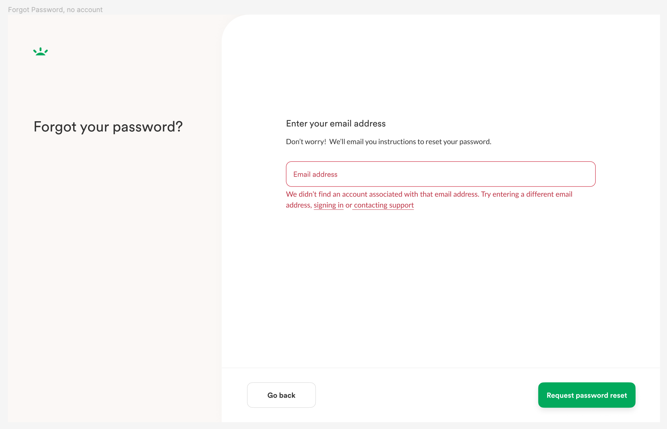
Original copy

Revised copy
Sign up with an email that already has an account:
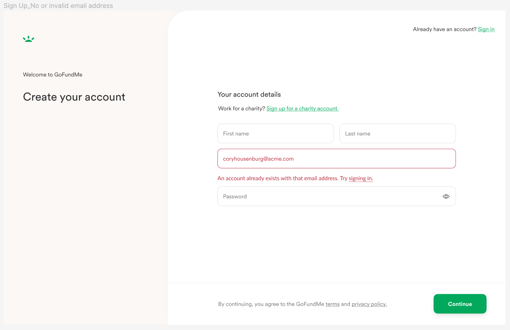
Original copy
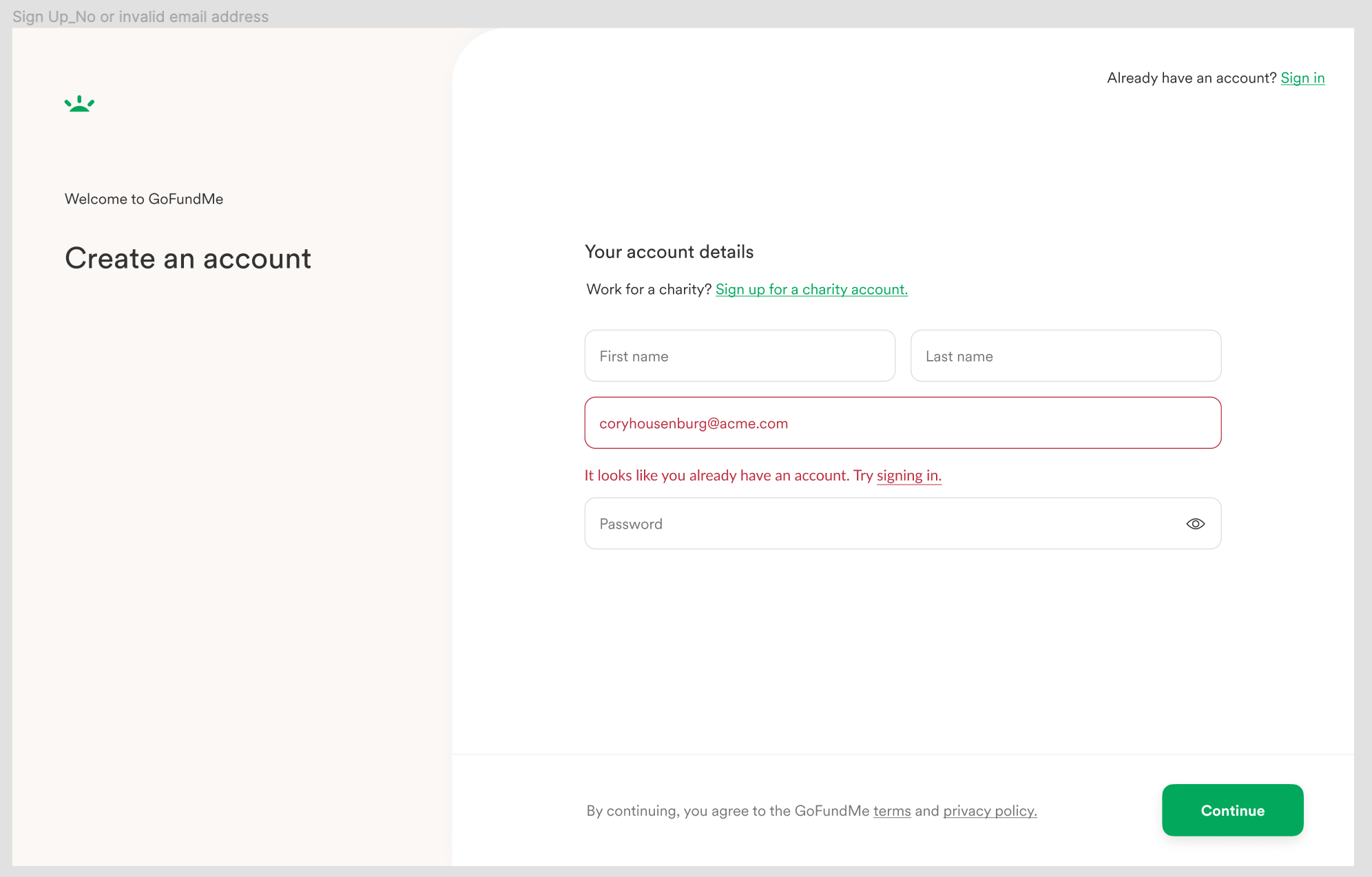
Revised copy
Results
This project will go live next year, but I am excited to see the quantitative results to come from more helpful error messages and a clearer, more consistent experience.